


Arts of Book Publishing: My Novel Finds Form
A book's visual representation in the world is its own interconnected art.

My debut novel has a cover…
…and I’m absolutely thrilled by it.
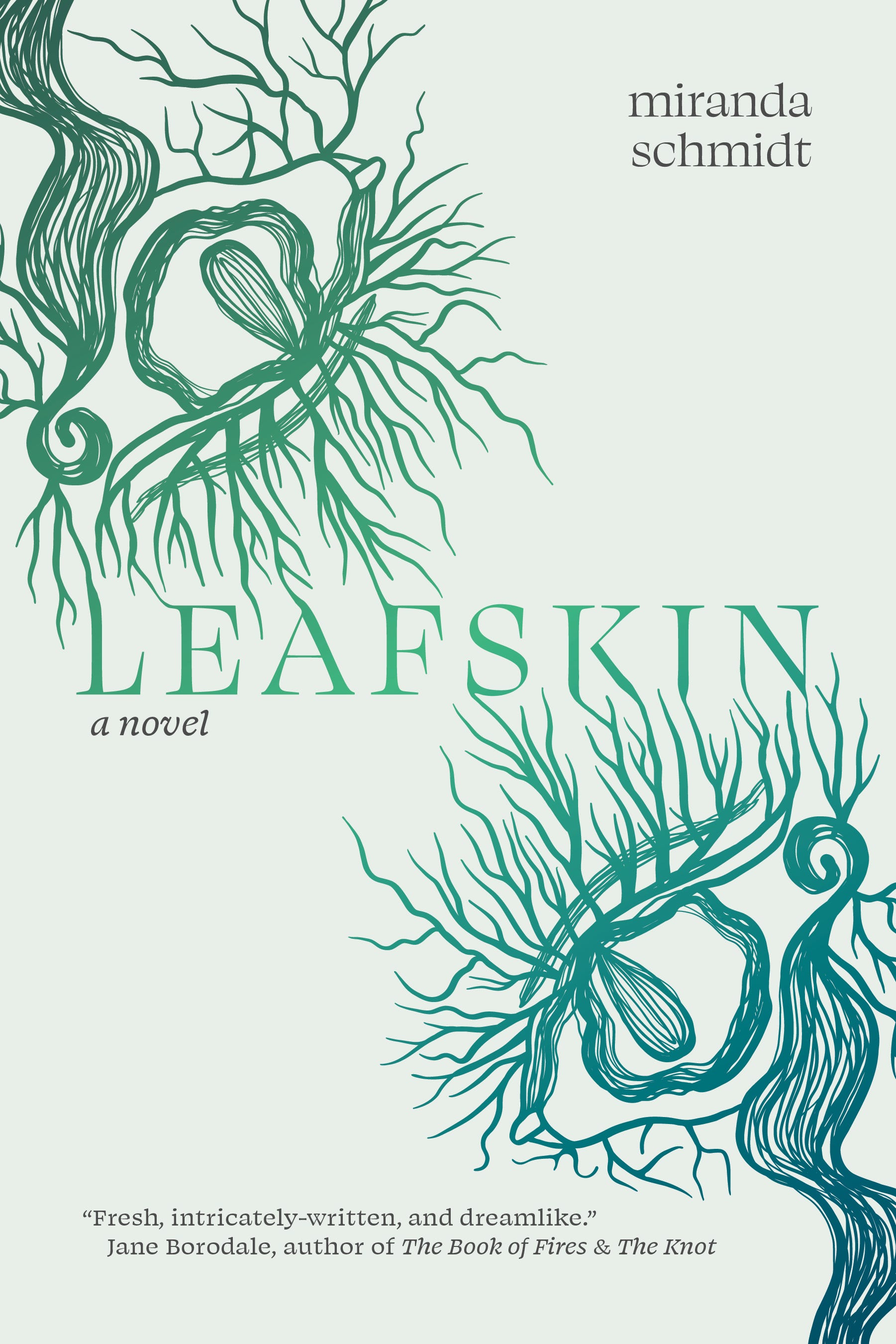
This cover gets at the strangeness of Leafskin, the attempts to bridge across dualities, and the embodiments that the humans in the story experience in their relations to the more-than-human world. The double image is, to me, an eye, a tree, a lock of hair, a wave, a seed, an embryo. It reaches outside itself to create something new. That the title is made by the reaching and meeting of branch/lashes is, to me, a deeply resonant representation of what my novel itself is trying to do.
Leafskin is about the creation of art. It’s poet main character and her artist lover collaborate to make paintings that incorporate words and leaves and petals. They’re shared dreams bring them images that they attempt to represent in their different art forms. Looked at from one angle, Leafskin is about the creation of shared visions and creative collaborations across species.
As Leafskin’s visual presence begins to emerge in the world in a way that is both separate from, and deeply interwoven with, my own visual presence as an author, I’m reflecting on all the visions that need to harmonize in order to create a strong artistic experience for readers. I find the process, from cover to author photo to web presence, absolutely fascinating.
The Cover
Leafskin’s cover works so beautifully because of the immensely talented team my publisher, Stillhouse Press, gathered for it. Artist, Alex Giron, created the image that I’ve taken to calling the eye/tree. I was immediately drawn to this image and its wild multiplicity. Cover designer, Michael McDermott took this image and doubled it, creating the relationship with the title, all while choosing just the right fonts and colors.
I was lucky in that I was able to be involved in the creation of the cover. Stillhouse asked me to assemble an initial moodboard with covers I liked that were in the realm of what I could imagine for Leafskin. The moodboard (excerpted below), along with the novel itself, provided inspiration for the cover design.


Stillhouse is a teaching press connected to George Mason University and it was art students who created initial art for the cover design. Alex Giron’s eye/tree, myself and my publisher agreed, felt like it was of the novel and became a clear image to represent the book. When the eye/tree doubled in the cover design it felt like many of the book’s key themes had taken visual form.
The whole cover creation process felt very collaborative with Stillhouse. There are so many considerations that go into the making of a book cover. For me, as the author, one of the most important is that the cover feels like a true visual form for the work. But there are also immensely important considerations around publicity, the limitations and possibilities of the book materials and printing, what kinds of covers will draw the interest of readers who might like the book, what other book covers this book will be next too, etc. The Stillhouse team took all of these considerations into account. There was a lot of back and forth around color and I saw versions of the current cover in a variety of hues. The blue/green gradient feels particularly suited to the land/water movements of the book itself. One of Leafskin’s character has an uncanny affinity with trees and another paints waterscapes and may be a selkie. This is a deeply blue and green book.
The Author Photo
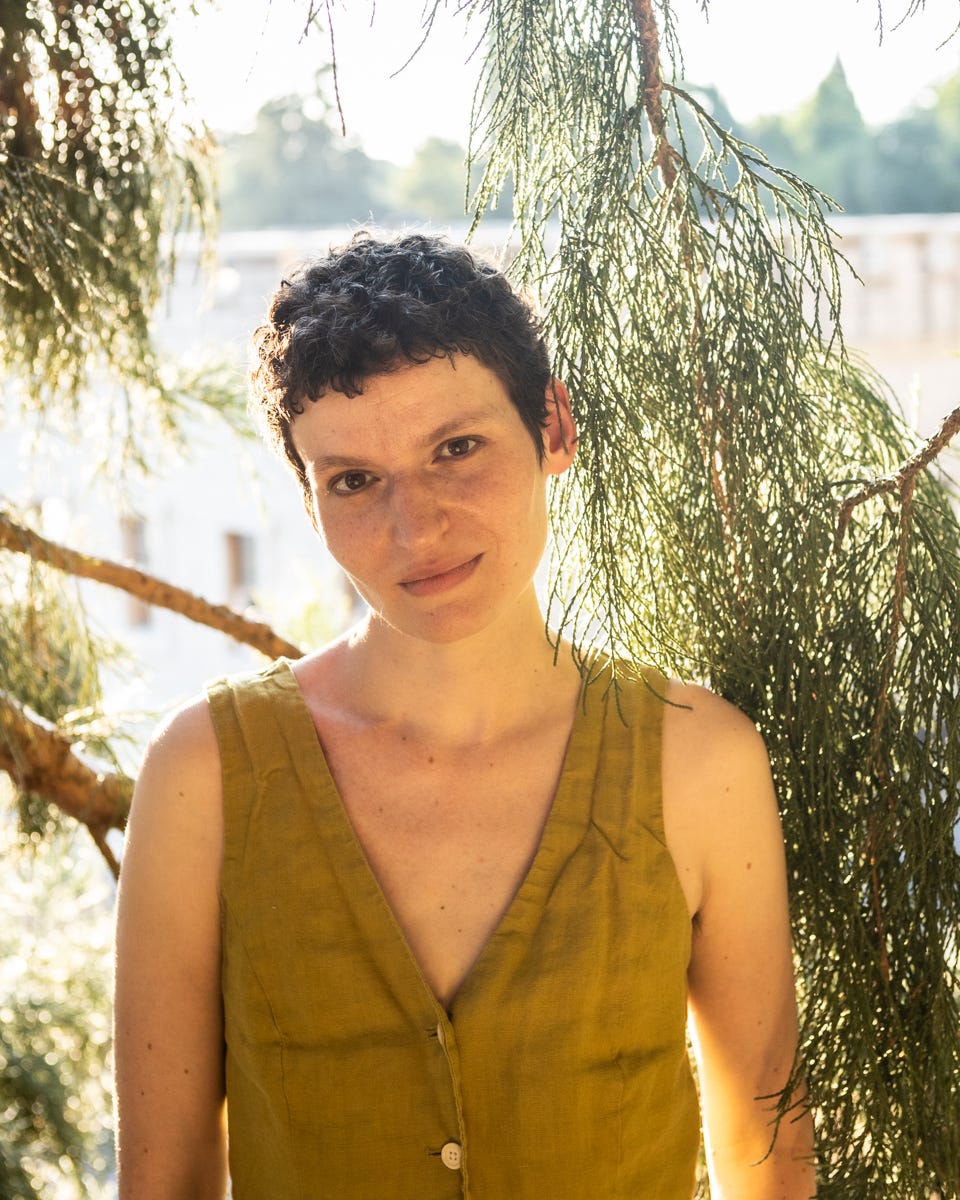
This past summer, I had my author photos taken by the wonderful photographer Ebenezer Galluzzo, recommended by my dear writer friend Callum Angus. We shot on Mt. Tabor beneath the sequoia tree under which I wrote part of Leafskin. It was a warm sunny evening and the light was just beginning to slant toward dusk. We tromped around Tabor, pausing under trees, arranging leaves and branches. This was one of the most comfortable photo shoots I’ve ever experienced (I’m usually quite anxious when my picture is being taken). Partly, this was the location. Mt. Tabor is a place I dearly love. I know the trees and paths there and they know me. Partly, this was the photographer. I admire Ebb’s work and trusted his process and vision to hold me in just the right light.
In the lead up to my author photos, I read Chelsea Bieker’s “Hot and Haunted” newsletter and found it immensely instructive and inspiring (I’d recommend anyone give it a read if you’re about to have your picture taken!). As I considered photos, I thought about what they needed to convey about my book and about me as an author. I knew I wanted to take them outside, that they needed to hold a sense of connection between the human and nonhuman. I knew I wanted them to feel queer in the particular way that I and my work are queer, which is a hard thing to describe, but which Ebb immediately understood. I also knew I wanted the photos to feel like art themselves, that I wanted them to have an aesthetic that held some of the photographer’s own artistic vision.
Ideally, an author photo can help to deepen a reader’s engagement with the book. The photo is its own work of art. It represents the author out in the world, entangles with the book, and takes on its own kind of life. I had some great options to choose from, all conveying slightly different elements of myself and my work. So, of course, I let Instagram weigh in on which to use.
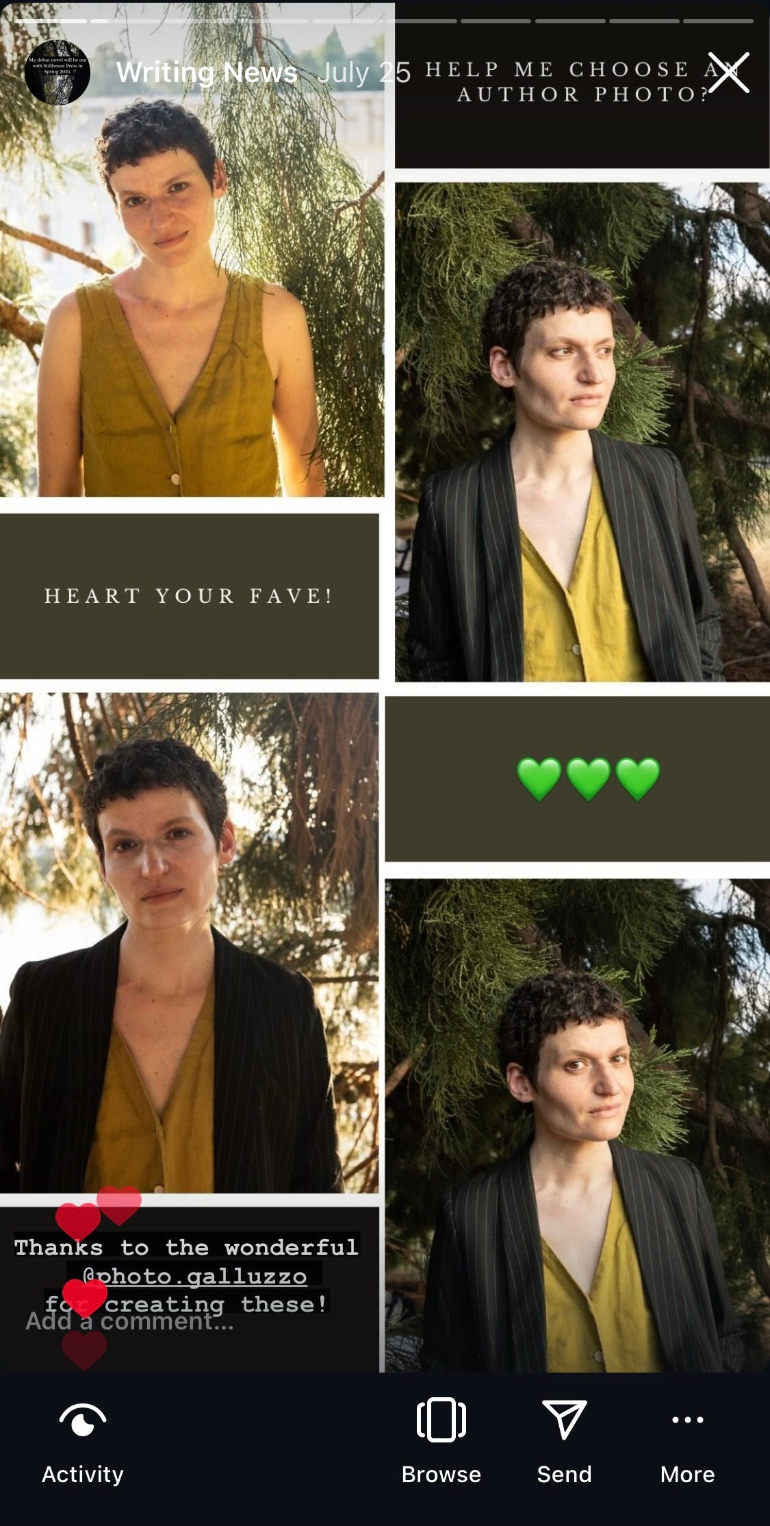
In the end, I chose the one with just the vest. It felt spritely and a little bit magic. There’s a vulnerability to that photo that I think comes through in my writing. And it captured the essence of my relationship with the sequoia. Some of my close friends who know me and my writing well told me it seemed like the right one to them. While the vest photo is me as a writer, I chose the blazer photo looking away from the camera to use for teaching purposes. There’s an authorial authority to that one that feels very useful and captures part of who I hope to be for students.
The Webbing
A cover and author photo is just the beginning. Shortly after we settled on the completed cover, Stillhouse sent me a little digital kit with image types and variations and instructions to update everything. I’d already put my new photo up on my website and social media. Now my cover got to join it. I do my own website, which means I’ve been spending quite a bit of time tinkering with Squarespace and trying not to be overly ambitious with my design changes.
One of my favorite parts about working with the visual elements of this book is the eye/tree. Excerpted, it can feel like it’s own little creature.

I’m still learning how to use these as accents on my website and I’ve started trying them out in my email signature.
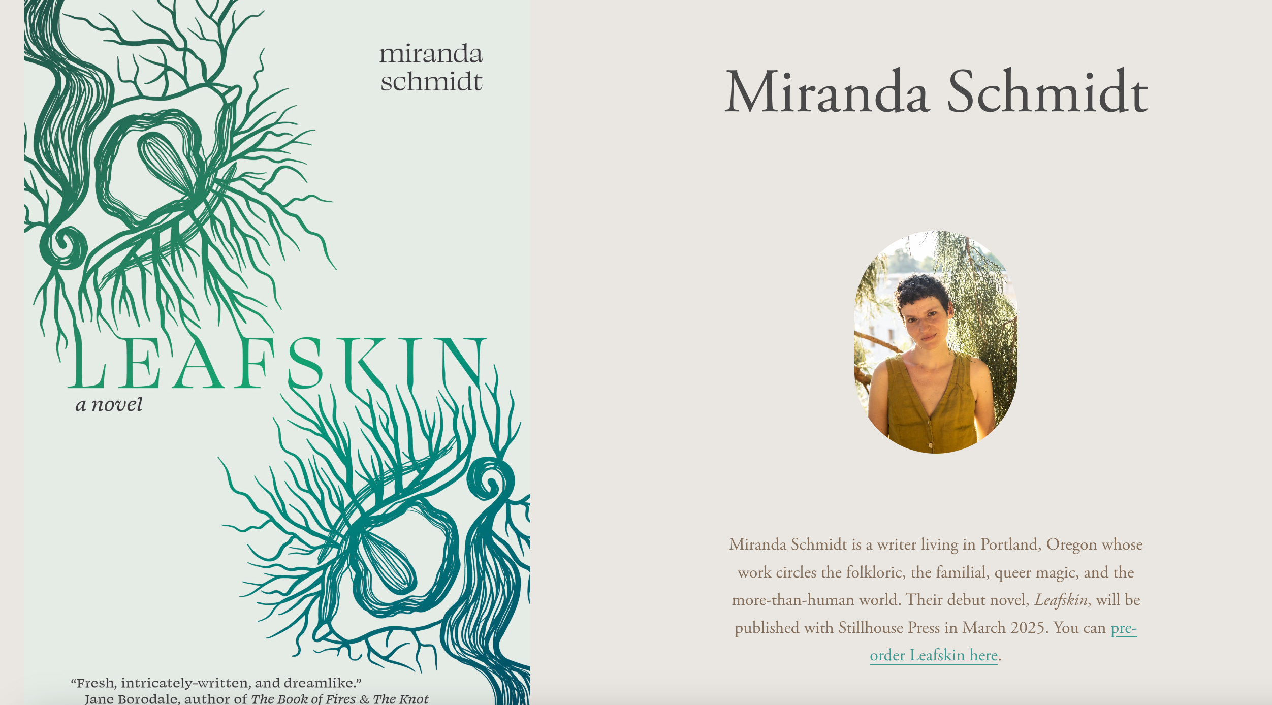
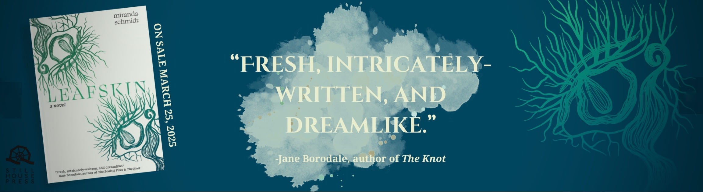
This beautiful banner featuring a very kind quote from brilliant writer and teacher (and my former PhD advisor) Jane Borodale is up on the Stillhouse Press website.
And these cover reveal images posted to Instagram last week.


My novel is no longer a simple word processing document on my laptop. It’s taking shape out in the world. Thanks to so many remarkable artists and designers, Leafskin now has visual form. What once was only my words on the page, is now color and shape and a whole visual aesthetic. The beloved sequoia I wrote parts of the book beneath, a contributor to the work in their own right, surrounds me in my author photo. In the very near future, I’ll be holding a physical copy of Leafskin in my hands. And, soon, so will you.
Leafskin will be published March 25, 2025 and you can preorder here.